Part Two: Do you need to love art to light art?

A self-professed lover of Art, Cliffe Tribe, Sales Manager at Casambi, has enjoyed a lighting career journey that has so far taken in many industry milestones – through the 20th-century analogue age into what he calls ‘the digital magic of today’. Cliffe’s written a series of blog posts on lighting as the love language of art and how Casambi’s wireless control solution is contributing to a modern-day revolution in how we display it. Here is part two;
Part Two – Colour and Line
Claude Monet (1840-1926), arguably the supreme leader of French impressionist painting, remarked:
“When you go out to paint, try to forget what objects you have before you – a tree, a house, a field. Merely think, here is a little square of blue, here is an oblong of pink, here a streak of yellow. Just paint as it looks to you; cover each exact colour and shape until it gives your own naive impression of the scene before you”.
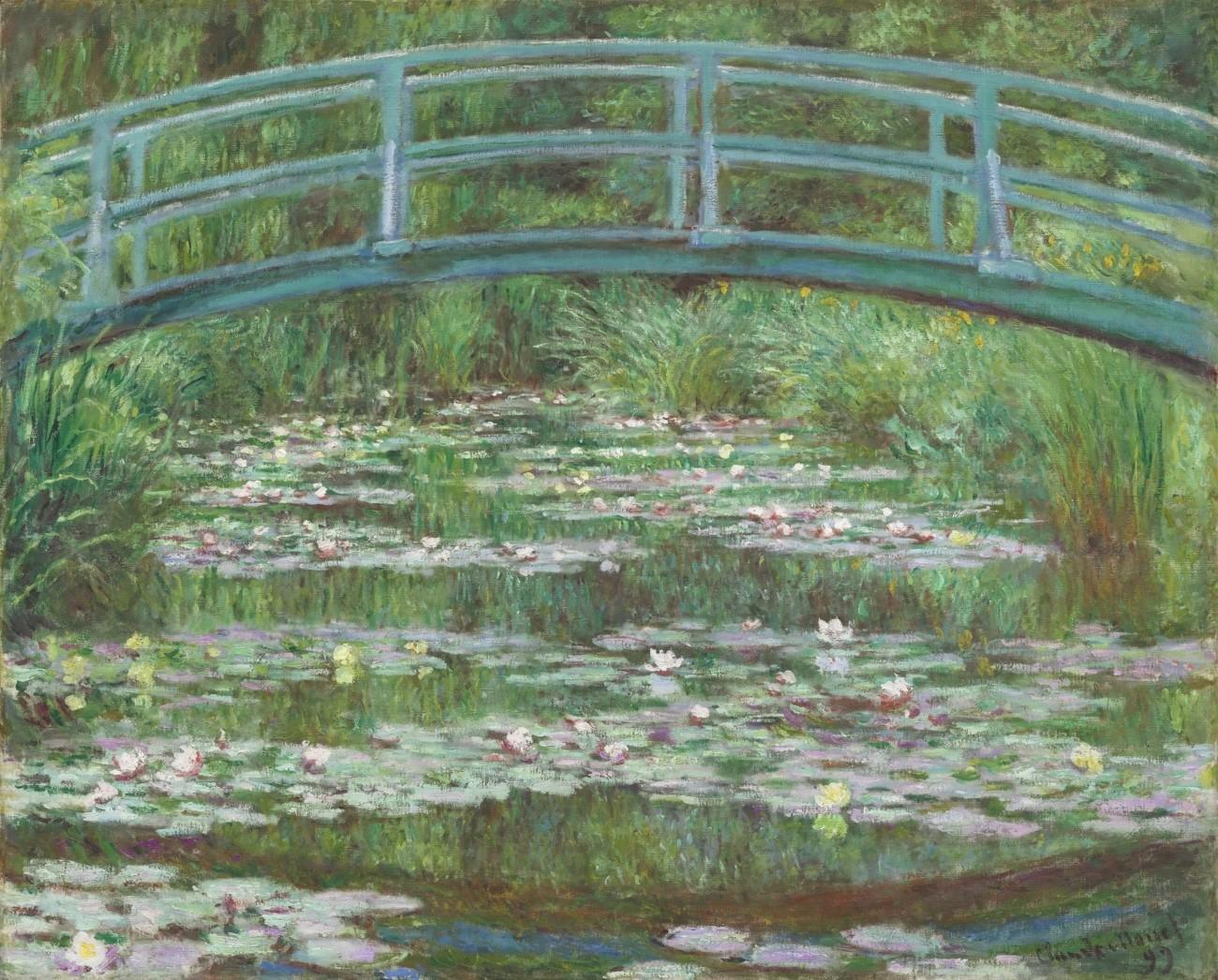
Just the name, Monet, conjures up delightful thoughts of sun-drenched, willow-lined riverbanks, picturesque bridges, and lily-adorned ponds. With Monet (as with others) we need to carefully focus on the major parts that colour and line play as fascinating storylines tumble from amazing works of art.
For this, the second in a series of blog posts, I want to examine colour and its associates. Perhaps this is the most important element when viewing art, but as with everything connected to the topic, that’s a highly subjective statement.
As described in the first blog on the subject, Casambi wireless lighting controls contribute significantly to how a painting might look post-commissioning. Using a mobile phone or tablet with the Casambi App installed, the lighting team has the freedom to roam the gallery viewing space, examining a piece from every possible position and angle, easily adjusting light levels, not hampered by fixed lighting controllers and trailing cables.
The importance of colour and lines when storytelling
The artificially lit canvas ‘must have’, guiding a viewer through a potential labyrinth of storylines embedded within a painting, will be the promotion of colours and lines – the number one ingredient in the depiction and definition of artwork narrative. This is how mood and depth are portrayed, with lines being the common denominator – a basic element of the structural importance of the piece. All the while colours, especially warm and cool colours, dictate the form. History tells us that auction houses around the world would expect to achieve their highest prices for paintings where colours, at opposite ends of the spectrum, impact the artwork. A painting where red dominates will statistically be the most expensive, followed closely by blue.
Yellows and oranges wrap the viewer in a blanket of warmth and serenity. Reds, however, especially when set against a black background, fiercely evoke messages of anger and rage. You really do not want to be alone when observing the work of an artist in pain. Especially one who really wants to express, on the canvas, the anguish they were in.
Italian painter Caravaggio (1571-1610) in his biblical depiction of Holofernes’s death at the hands of Judith seems determined to vividly show us the brutal extent of the assassination. The reddest of red blood pouring from the Assyrian general’s throat is one of the most horrific, but completely beguiling of all fine-art portrayals.

In collaboration with curators, designers, and luminaire manufacturers, should we not, when ‘going out’ to illuminate a work of art, absorb ourselves in the period, setting and imagination of the artist? What did these centuries-old art-storytellers want us to see in their masterpieces? How hard are they trying to get us to completely buy into the meaning of an epic piece?
As modern-day lighters, is it not our responsibility to definitively represent a work of art no matter how distasteful the subject matter might be? At first glance, we assume that Caravaggio wants us to be appalled at the nature of Holofernes’s death. In consequence, our eyes are magnetically drawn to both the thick red blood gushing from his throat and the sheer terror on his face. Therefore, our first inclination is to narrowly focus a warm white LED cluster on the area around the poor old giant’s soon-to-be-removed head. However, let’s have another look – would he also not want us to see the strength of this slightly young girl and her somewhat quizzical look, or even the “go on, go on, do it” determination of the maid? Is Judith surprised to see so much blood or just mildly curious at how easy it was to get the job done?
There have been many paintings depicting Holofernes’s death at the hands of Judith and each as they travel from gallery to gallery, exhibition to exhibition around the world, needs to be lit in collaboration, ensuring the story is told accurately through its colours and lines.
This is how the artist would want it – without the correct imagining through carefully controlled artificial light, the red blood can appear flat and the expression on Judith’s face may be missed entirely by the viewer. The correctly selected high-performance LED cluster with fine lensing attached to a projector, complete with the optimum light level control via the Casambi App, can give equal prominence to both the spurting blood and quizzical expression. This engineered consideration produces depth and dimension, drawing the viewer closer to the artwork itself and allowing for more understanding of what the artist is trying to say in their work.
Rembrandt van Rijn’s (1606-1669) biblical epic, ‘The Storm on the Sea of Galilee’ uses the chiaroscuro technique (Rembrandt’s light) to highlight both the white tips of the waves and those figures to the left of the painting. The fact that Jesus Christ is almost (but not quite) hidden on the dark starboard side of the boat seems almost irrelevant really. Or is it? We are aware of his presence because Rembrandt has allowed a little holy light to envelop him and those who are listening to him, but our eyes are initially very much drawn to Peter and the disciples portside who are valiantly battling the storm.

So as lighters where should the focus be? On Jesus, without fear, calmly telling us that it is just a storm, and it will pass, or Peter and the others who are clearly extremely frightened and desperately battling to keep everyone aboard safe and well? But wait, there is something else here, something quite extraordinary. The Bible tells us that there were thirteen men in the boat, but if one looks closely enough at the dark side of the painting, there does appear to be a fourteenth man. Who is he? Popular myth tells us that the mischievous Rembrandt actually painted himself into the piece – brilliant!
The blues, greys, and the blacks in this astonishing masterpiece, sadly stolen in 1990 from the Isabella Stewart Gardner Museum in Boston, have equal relevance to ‘Rembrandt’s light’ when telling the story. They not only beautifully depict the severity of the storm as the vessel heads into the eye, but also tell of Jesus’s spiritual message, that all storms in life will pass if one only looks toward the light.
If the question is, how to bring out the lesser colour in the painting – a colour for instance that appears bland in ambient light and lost behind a more dominant one? Then the answer is to choose top-performing LEDs with high colour rendering indices and train them through a range of targeted narrow spot lenses – punching through a staple wider flood for a general distribution across the canvas. All accurately dimmed to an eye-catching and intriguing level through the Casambi App.
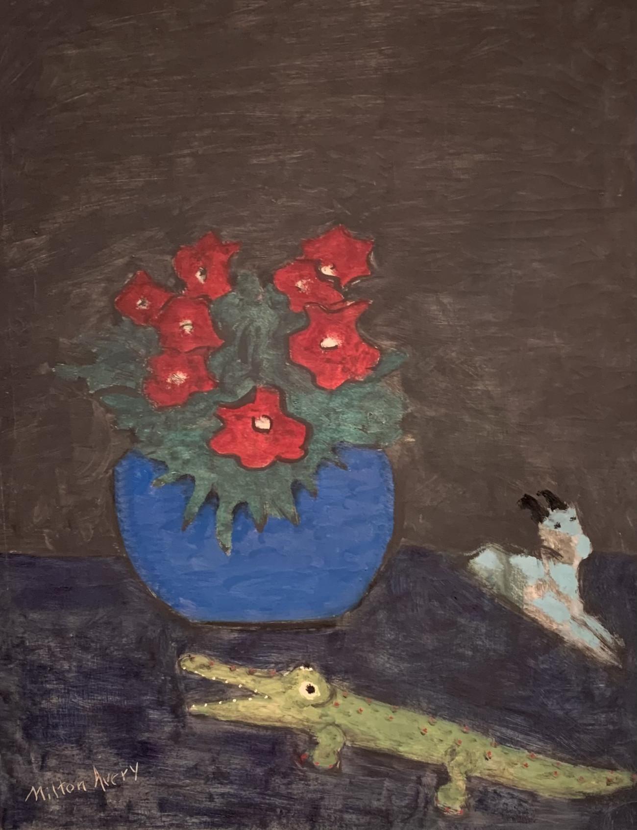
Milton Avery (1885-1965) is considered one of North America’s greatest 20th Century colourists.
“I try to construct a picture in which lines, spaces and colours, form a set of unique relationships, independent of any subject matter.”
The ability to be flexible when moving around a gallery viewing space is accentuated by the simple use of the Casambi App on mobile phone or tablet. It is possible to adjust, configure and therefore manipulate how the light strikes the painting.
By having the freedom to easily adjust light direction and levels, the lighter can fully examine the underlying colour tints and how the lines, shadows and highlights within the art may be displayed. This forensic examination helps produce a final depiction that enhances colour and produces shape, form, and justifiable dynamism to the painting.
The illumination of artwork today is so incredibly impactful thanks to high-performance LED light sources and easy-to-use lighting tools such as refined optics and Casambi wireless lighting functionality.
Mix in some ‘love-the-subject-matter’ collaboration from the lighting team and we are getting even closer to truly displaying the amazing stories that lie in front of and behind the masterpieces.
Interested in learning more about Casambi? Drop us a note, and we’ll reach out to you: