Nagnata Flagship
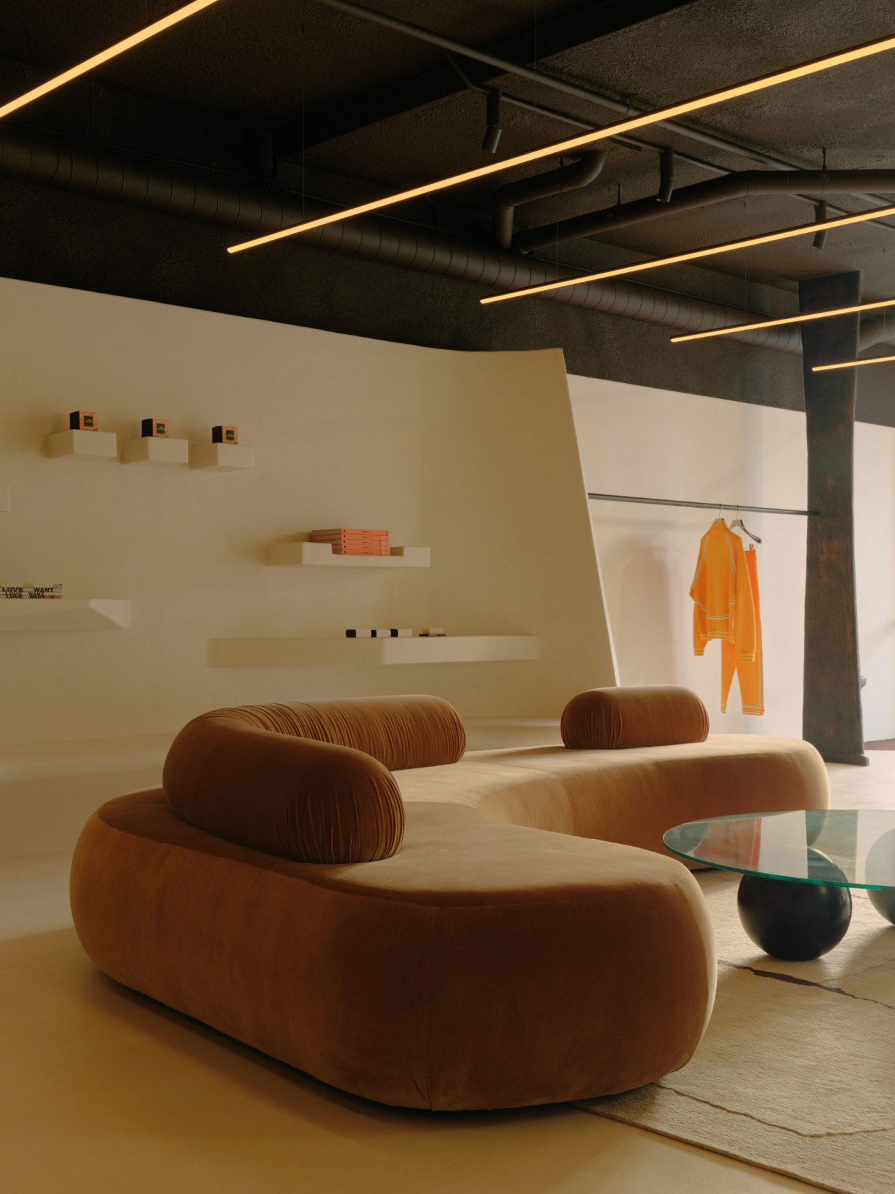
On a very modest budget, with an exceptional creative vision ambience lighting realized an awe-inspiring space that truly challenges retail design principles and captures the spirit and vision of the client in a way they themselves never imagined possible.
Melbourne-based ambience lighting was briefed by interior designers Pattern Studio to develop a disruptive lighting concept for cult fashion and lifestyle label Nagnata’s Byron Bay flagship store.
This project resulted in a very unique design for a retail environment. Aesthetically, the brand’s garments give a nod to the ‘60s and ‘70s. The store concept also pulls inspiration from the striking works of Hungarian architect Antti Lovag, French ceramicist Valentine Schlegel and various other artists of the last 50 years who’ve explored ideas deeply rooted in the relationship between architecture, color, human movement and emotion.
Lighting Design
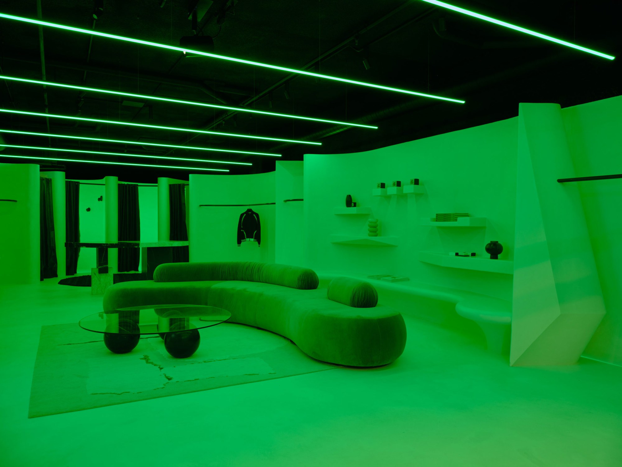
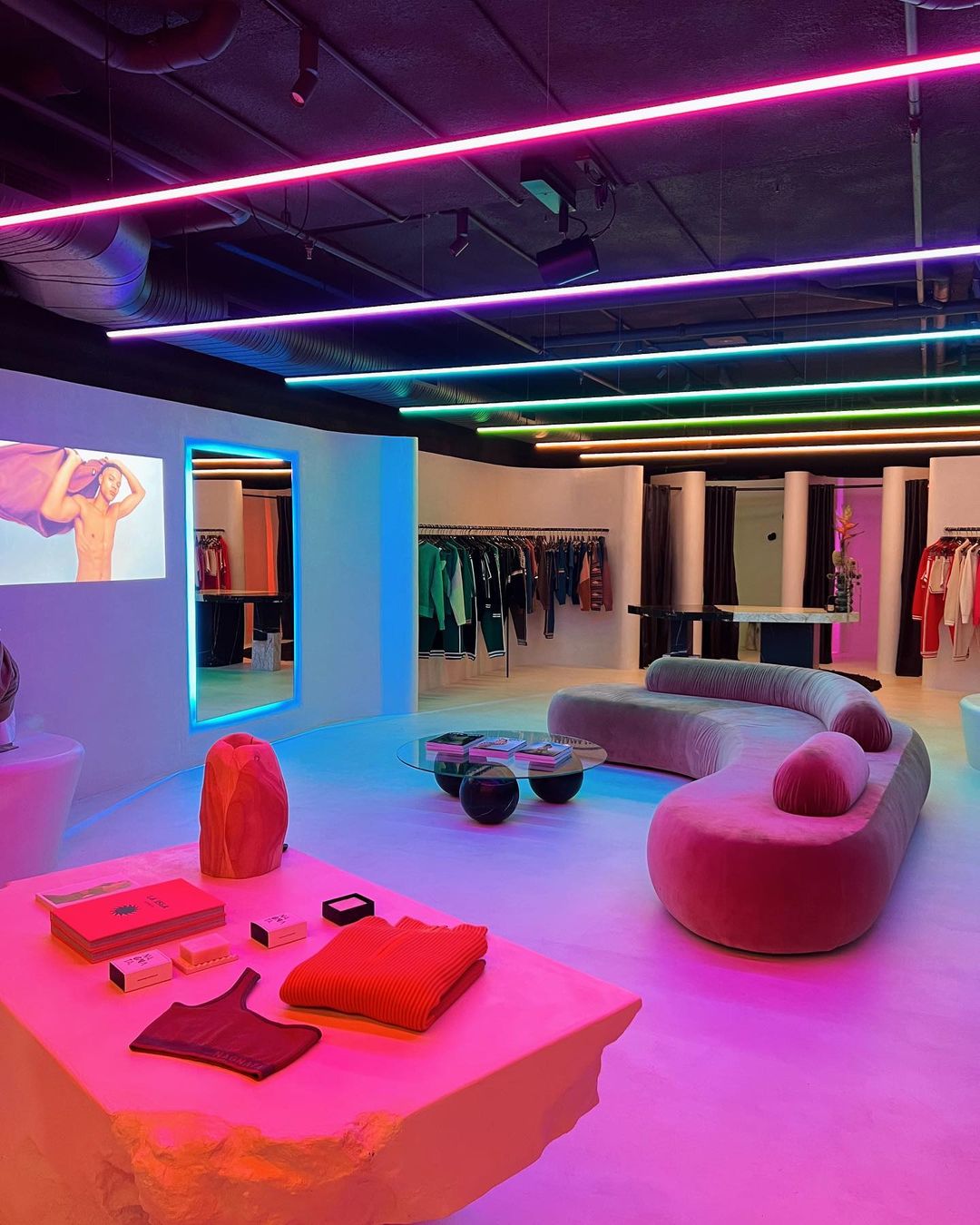
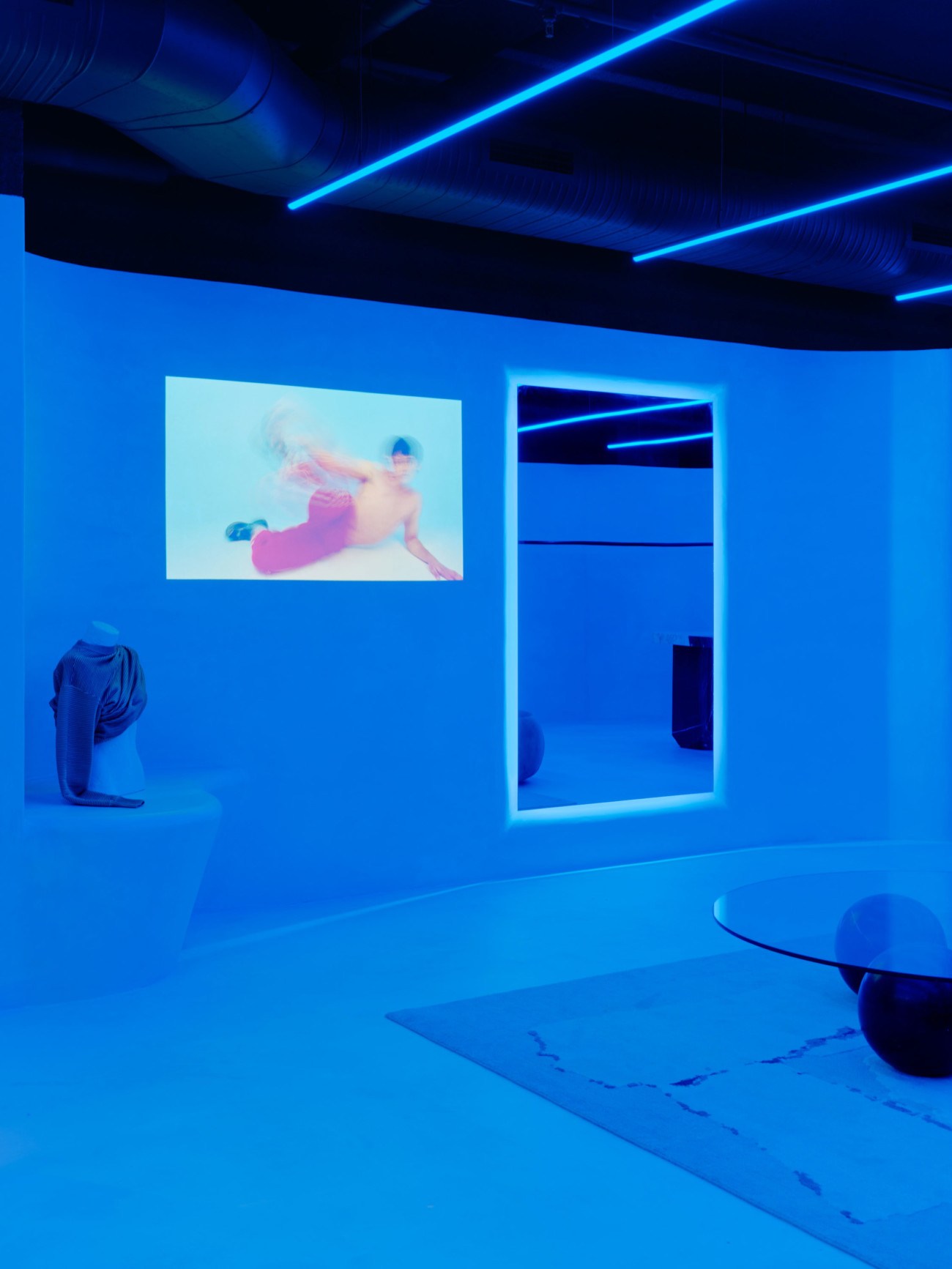
‘Lighting design plays a critical role in not only helping to communicate the vivaciousness of the brand but is crucial in making Nagnata Flagship such a triumph. The spatial approach is obviously very important. Offsetting the palette of hyper-tactile, earthy finishes is the hallmark of the space – a procession of Casambi-controlled RGB WW linear luminaires that run centrally through the ceiling. They work hand-in-hand with various other RGW WW sources that are thoughtfully concealed in multiple nooks, cracks, holes, joinery and mirrors within the environment to bathe the entire store in a wash of colored light’ says Stephen Justice of ambience lighting.
The immersive concept is achieved through a series of linear lights fitted with Tunable White LED strips and also RGB+ 2700K strips. In alignment with their sustainability endeavors, ambience lighting used fittings with high recycled aluminum content as well as luminaires from local brand, Symphony Lighting.
Scene setters
While the lighting has been layered in a thoughtful, pragmatic way, it’s also been configured such that it can change its appearance on cue to be playful – no two moments are the same. The scene design follows natural daylight colors and tones from dawn to dusk, then after dark things get more up-tempo. On one visit you may be immersed in a scene simulating sunrise or sunset off Byron Bay, the next, it will have metamorphosed into a futuristically electrifying and energetic space.
‘We collaborated to realize a lighting design that mimics and celebrates the brand’s artistry, movement, and unapologetic refusal to conform. Illumination was pivotal to both the space and the brand experience itself’ says Stephen.
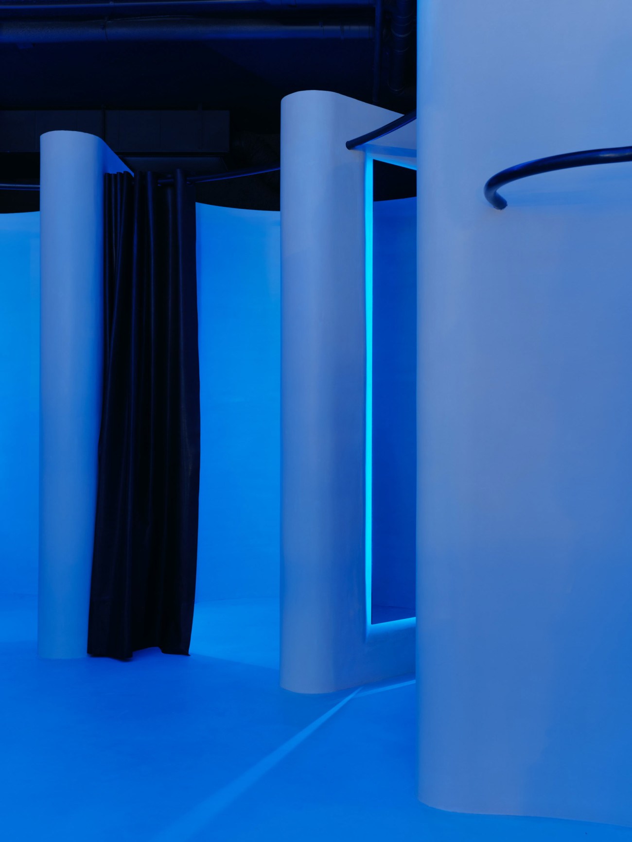
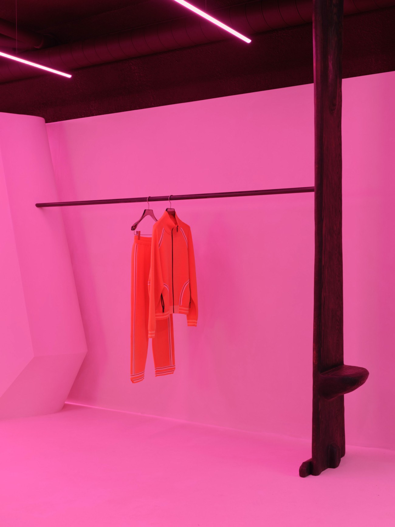
When visitors experience Nagnata, they are never quite sure where the color is coming from, it almost feels as though they have painted the entire location using light, transforming this stylish serene sanctuary into a charismatic and exuberant environment. Stephen explains that they wanted a design to match the cavalier and disruptive spirit of the brand. It also had to match the product itself in color and look.
Total control
All the lighting throughout the store is controlled using Casambi, from the linear lighting overhead to the track lights highlighting products, to accent illumination. Even the front window displays utilize Casambi to integrate within the themes. They ran a colored gradient through the entire location from window displays to Phillips Hue RGB in the fitting rooms to marry in with the linear fittings. An incredible feat technically and visually.
‘We wanted more flexibility and control over the space. The functionality and usability of the [Casambi] app are crucial to the successful integration of our vision. And importantly, it’s easier for the staff to pre-set the number of scenes they wanted to create with colors, tones and time. Casambi obviously remembers all the scenes and settings, so they don’t have to reset’.
‘But most importantly, we just love the creative and technical possibilities of it. We played around with scenes and learned how to program everything from within the app. This was a massive learning process, the capabilities for what we want to do are limitless. In the wash–up, the client, staff and customers absolutely loved it, and we’ve even been able to set topical scenes, for example, a rainbow–themed aesthetic to celebrate Pride month’.
Sustainability
Stephen also acknowledges the green benefits of going wireless:
‘We could generate massive savings in terms of the resources that go into making, selecting, installingand maintaining cables. Bigger groups of fittings can be pre-set to pre-determined operating hours and dimming levels so that the lights are not left on when they’re not needed (lighting is activated by motion), and the brightness can also go up/down during different times of the day (enabling human-centric lighting). Lighting scenes can be controlled/tweaked from any location globally so there’s no need to fly technicians down to the site for any changes which saves hugely on commute costs and related emissions. It enables control on both a centralized as well as individual basis so we can force a space to be a certain way if need be or give the end users open rights for customization’.
But there has been one complaint from staff, Stephen confesses. In a bid to get a good look inside at night, too many people will press their faces to the window creating extra smudge-cleaning tasks each morning.
‘But we think that’s a great problem to have’.
Interested in learning more about Casambi? Drop us a note, and we’ll reach out to you:
Site
Nagnata Flagship
Location
Byron Bay, Australia
Interior design
Pattern Studio – interior design
Lighting design & commissioning
ambience lighting – David Justice, Josh Cain
Lighting supply
Symphony Lighting

Share your work with us
If you have a Casambi project that you would like to publish at Casambi.com please click the button below and tell us a little bit more about the project. We’ll get back to you within two business days.
